Simple website design is not about saying less than your customers need to know. It is about making useful information easier to find and the next step easier to understand. A quiet layout can still contain detailed service descriptions, photographs, specifications and answers to common questions.
Start with what someone visits your site to do: understand your offer, check whether it suits them and decide how to proceed. These nine arguments combine the benefits of simplicity with practical checks. None is a promise of more enquiries or better search rankings. Test the actual tasks, not just the appearance.
1. Give each page a clear purpose and action
A page with competing messages makes it harder to identify what matters. Give the main action enough space, but explain the offer before asking someone to act. Simplicity can support an enquiry or purchase by removing avoidable obstacles, not by pressuring visitors or hiding conditions.
For a small repair business, a service page might explain the problems handled, the service area and what to include in a request. A clearly labelled enquiry button belongs beside that explanation. A newsletter invitation should not interrupt the form or compete with it.
How to check it: Ask a new visitor what the page offers, what the main action does and what happens after submitting it. Rewrite anything they have to guess.
2. Choose durable patterns over decorative trends
Clear type, consistent spacing and recognisable controls do not depend on a fashionable visual effect. They give you a stable foundation when photographs, offers or service details change. A simple design is not maintenance-free, and keeping an old layout is not a reason to ignore usability problems.
A local consultancy can use the same heading style and service-page template across its site while giving each service its own explanation. Its identity can come from colour, photography and tone rather than an animation that must be redesigned whenever the content changes.
How to check it: Replace a short heading with a realistic longer one. Check whether the layout still works without custom fixes or cutting useful words.
3. Organise navigation around real choices
Visitors should not need to learn your internal department names to find a service. Group related pages and use familiar labels. There is no universal ideal menu size: a short menu that hides important choices is not simple. Remove interruptions before removing content people need.
A small catering site could group menus by event type and keep dietary information beside each menu. It need not promote every dish in the main navigation. An enquiry route should remain visible without a pop-up covering the choices someone is comparing.
How to check it: Ask someone unfamiliar with the business to find a specific service and its contact route. Watch where they hesitate rather than explaining the menu.
4. Use familiar controls and understandable forms
Familiar patterns reduce the amount someone must figure out before using your site. Keep navigation in a consistent place, make the logo a route home and label buttons with their action. An unexplained icon is not automatically simpler than a short text label.
Some basics are worth keeping because visitors look for them before they read anything else:
- A logo in the header that links back to the home page.
- Main navigation in the same place on every page.
- Contact details in the footer: phone, email and, for a local business, the address.
- A search field near the top when the site has more pages or products than a menu can show.
- A cart icon that stays visible on an online shop, so buyers can check what they have added at any point.
On a booking enquiry form, label each field and explain which details are required. Keep entered information when an error occurs and say how to correct it. A generic confirmation should not imply that an appointment is accepted if staff still need to review the request.
How to check it: Complete the form with a keyboard, submit an incomplete entry and check the feedback. Confirm that focus is visible and labels remain understandable.
5. Make important content readable for your audience
Simple does not mean universally appealing. Your audience still needs readable text, clear contrast and content suited to its questions. Descriptive headings, short paragraphs and useful lists make a detailed page easier to scan. Do not replace essential explanations with images that leave the meaning unclear.
A small equipment supplier can separate specifications, compatibility and service exclusions under clear headings. Keep those facts available on a phone rather than removing them to shorten the screen. Photographs should support the explanation, with useful alternative text where needed.
How to check it: Read the real copy on a narrow screen and enlarge the text. Check for clipping, awkward line lengths and information available only through a visual cue.
6. Measure loading instead of assuming it
A visually sparse page can still contain heavy scripts, oversized images or unnecessary integrations. Simplify the implementation as well as the screenshot. Keep useful media, but choose appropriate image dimensions and avoid loading decorative effects that do not help the visitor's task.
A small accommodation site may need room photographs to explain the offer, but not an autoplay background video. Test the published page on realistic devices and connections. Keep the existing page experience guidance as a reference for review, not a promise that a good score guarantees rankings.
How to check it: Observe when the main content becomes usable and whether controls move during loading. Investigate what causes delays before deleting helpful content.
7. Use spacing and evidence to build trust
White space means the breathing room between elements, not necessarily a white background. It helps separate a heading, explanation and action. Consistent typography and restrained decoration can make information easier to judge, but appearance alone does not establish that a business is reliable.
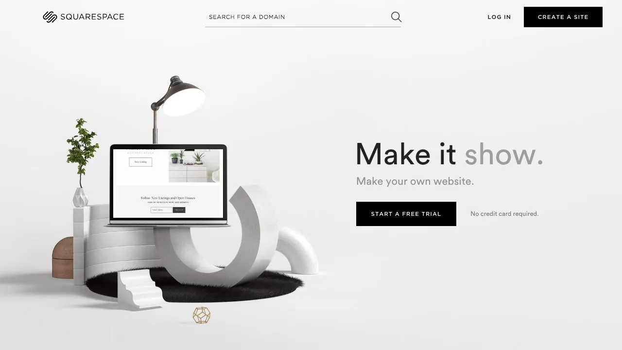
In the example above, the headline, the line of copy, the button and the image each have room around them, so the eye moves from one to the next and finishes on the button. The background is light grey, not white: white space is about the gaps between elements, not their colour.
For a small installation company, show genuine work photographs, accurate contact details and a clear description of what the service includes. Do not fill an empty area with unsupported badges or promises. Your business website should help visitors verify the offer, not merely admire it.
How to check it: Identify the evidence behind every trust claim and confirm that visitors can find the business details without guessing.
8. Make routine updates manageable
Reusable page patterns can make editing more predictable. That does not mean a simpler layout removes maintenance. You still need accurate content, appropriate access, software care and a recovery process. Decide who owns each responsibility before handing over the site.
A small training provider might update course descriptions using a shared template instead of rebuilding each page. Keep the fields understandable and document image requirements. An editor should not need to adjust decorative positioning whenever a description becomes longer.
How to check it: Ask the future editor to change a service detail and image, preview the result and explain how to undo a mistake.
9. Evaluate completed tasks, not visual simplicity
The argument that simple design works needs evidence from your own tasks. Fewer links or more white space do not prove better results. Look at whether people can understand an offer, submit an accepted enquiry or complete an intended purchase without avoidable confusion.
In the Cantrex Limited project, product pages and a quotation system work together: visitors identify the item and provide the details needed for a useful reply. Compare like-for-like tasks when reviewing versions, and investigate failed submissions rather than counting every button click as success.
How to check it: Follow an enquiry from page visit to receipt by the business. Note missing context, confusing steps and technical failures separately.
How to brief a designer for a simple site
Describe the audience, its main questions and the action each page should support. Bring real content rather than asking for an empty minimalist template. Include service limits, photographs, contact details and who will maintain the pages. Use examples to explain what feels clear, not to demand a copy of another site.
- Agree which tasks must work before approval.
- Identify essential content and optional decoration.
- Specify phone, keyboard and content-editing checks.
Review optional features by asking what would happen without them. Removing a decorative carousel may leave the task unchanged, while removing a product filter may make selection harder. Keep the useful function and improve its explanation. Simplicity is a way to organise necessary detail, not a rule that every page must look empty.
For the brief, separate visual preferences from functional requirements. Saying that you want a clean site is less useful than explaining that a visitor must compare services, find exclusions and send a relevant enquiry. A good website design brief also records which content you already have and which questions still need answers.
When a more detailed interface is appropriate
A catalogue may need filters; an online academy may need course navigation and account tools. Keep complexity that serves a real task. Simplify labels, grouping and feedback before removing functions people rely on. The same principle applies to a storefront: a clean screenshot is not worth an unusable product selector.
Frequently asked questions
Does simple website design mean fewer pages?
Not necessarily. Separate pages help when they answer different questions. Remove duplication, not useful detail, and make related information easy to reach.
Can a simple site still use colour and video?
Yes. Use them to explain the offer or guide attention. Check readability, loading and playback controls instead of treating every visual element as clutter.
Will simplifying my site guarantee more enquiries?
No. Your offer, content and enquiry handling still matter. Test whether changes help visitors complete meaningful tasks and check what happens to the requests you receive.
To plan a clearer site, review our website design service and tell us what your visitors need to do.